Understanding the Importance of Mobile Design
The Rise of Mobile Usage
Mobile usage has surged over the past decade. Over 60% of global web traffic now originates from mobile devices (source: Statista).
People use their smartphones for everything, from browsing to shopping. Mobile-first experiences have become essential, considering that users increasingly prefer their phones over desktops.
Apps and mobile-friendly websites are not just conveniences, but necessities to reach wider audiences.
Impact on User Experience and Business Success
A well-designed mobile experience directly impacts user satisfaction. According to Google, 53% of mobile users abandon sites that take longer than three seconds to load.
This highlights the need for fast, responsive mobile designs. A positive user experience leads to longer engagement, higher retention rates, and more conversions.
Businesses that prioritize mobile design can see tangible benefits, including increased revenue and better customer loyalty. Poor mobile design risks losing customers to competitors with more user-friendly platforms.
Key Principles of Mobile Design
Simplicity in Design
In mobile design, simplicity reigns as a core principle. Users engage more when interfaces are clean and intuitive. Minimalist designs improve usability by removing unnecessary elements.
For example, clear navigation menus and prominent call-to-action buttons streamline user interaction.
By focusing on essential functions and content, I create a seamless experience, which is critical for retaining users.
Responsive and Adaptive Designs
- Responsive and adaptive designs ensure optimal user experience across different devices. Responsive design adjusts layout and content dynamically based on the screen size.
- Adaptive design, on the other hand, uses fixed layouts tailored for specific devices. When implementing these designs, I test across various devices to ensure consistent performance.
- Using flexible grids and scalable images, I achieve a visually coherent interface. For instance, a responsive design might collapse a horizontal menu into a dropdown on smaller screens, providing easy navigation regardless of device.
Best Practices for Designing for Mobile
Optimizing Content for Smaller Screens
- Designers must prioritize clarity on smaller screens.
- It’s critical to use a flexible grid layout and scalable fonts to ensure readability. Line lengths should be kept short to avoid overwhelming users with dense paragraphs.
- Images should be optimized to load quickly and fit within the screen, preventing horizontal scrolling.
- Designers can use white space strategically to separate content sections, helping users focus on one piece of information at a time.
Leveraging Touch Controls
- Designing for touch controls requires considering user’s finger dimensions and tapping behavior.
- Interactive elements should be at least 48×48 pixels, per Google’s Material Design guidelines, to avoid tapping errors.
- Placing frequently used buttons within easy reach of thumbs enhances usability.
- Designers can also implement gesture controls, such as swiping, for intuitive navigation. Ensuring that touch targets are well-spaced avoids accidental clicks, improving user experience.
Speed and Performance Considerations
- Mobile users expect fast-loading pages. Reducing HTTP requests and minimizing file sizes can significantly enhance performance.
- Designers should leverage browser caching and content delivery networks (CDNs) to speed up load times. Lazy loading images and deferring offscreen content improves perceived performance.
- It’s important to test the design’s speed on various mobile networks, including 3G, to ensure a seamless experience regardless of connection quality.
Common Challenges in Mobile Design

Dealing with Multiple Screen Sizes
Designing for diverse screen sizes challenges mobile designers. Mobile devices range from small smartphones to large tablets, necessitating adaptable designs.
Implementing responsive design practices ensures an optimal experience across various screens using:
- flexible grids
- fluid images
- CSS media queries
adapts the layout for different dimensions.
For example, setting maximum-width properties keeps images proportionate while resizing. Testing designs on multiple devices helps identify and fix issues that arise due to differing screen resolutions.
Balancing Between Aesthetics and Functionality
Achieving harmony between aesthetics and functionality is crucial. While visually appealing designs attract users, usability retains them.
Clear visual hierarchy aids navigation and enhances user experience. Minimalistic design principles remove non-essential elements, focusing on core functionalities.
Use contrast and whitespace to highlight key features without overwhelming users. Ensuring interactive elements are easily accessible, like large touch targets for buttons, improves functionality.
Testing designs with user feedback reveals if both aesthetic and functional aspects meet user expectations.
Tools and Resources for Mobile Design
Design Software and Toolkits
Using the right design software is essential for creating effective mobile designs. I rely on tools like Adobe XD and Sketch because they offer robust features tailored for mobile interfaces.
Both come with pre-built UI kits that streamline the design process.
Figma stands out for collaboration, allowing multiple designers to work simultaneously on the same project. InVision integrates well with other tools, offering end-to-end design management.
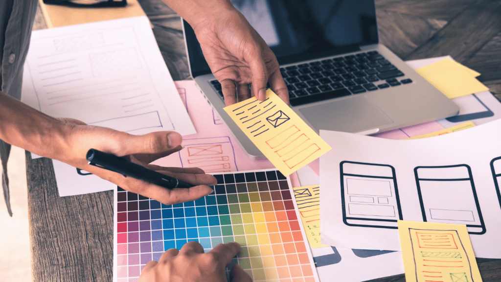
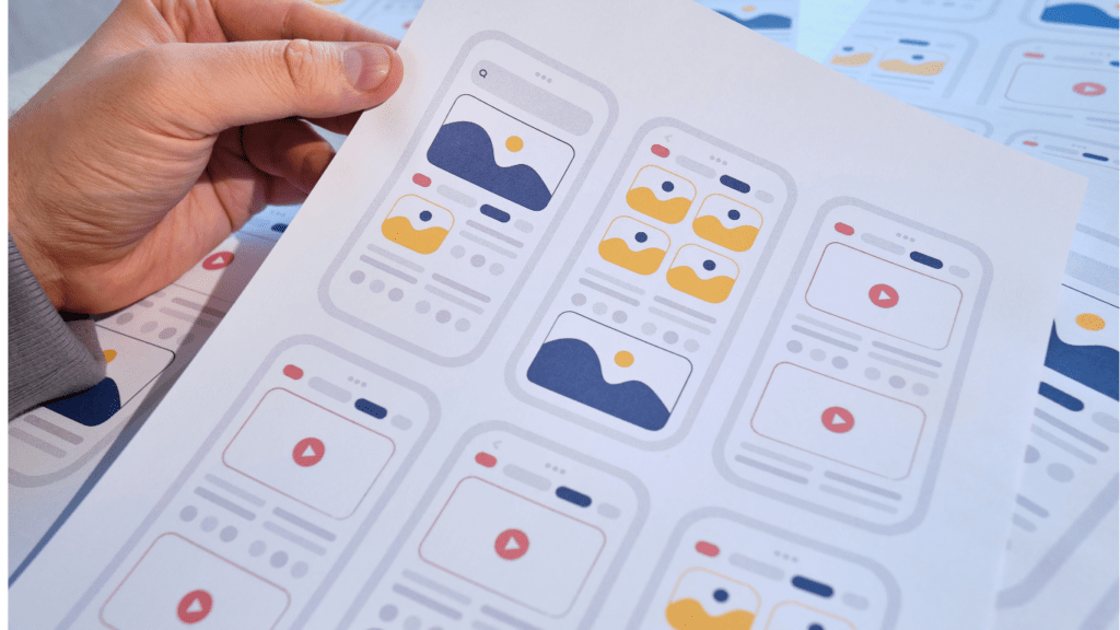
These platforms help in creating high-fidelity wireframes and prototypes, essential for visualizing the final product.
Testing and Prototyping Tools
Testing and prototyping are crucial for refining mobile designs. I use tools like Axure and Marvel to create interactive prototypes that closely mimic the final app. This helps gather valuable user feedback early.
I prefer UserTesting for usability testing as it provides insights on how real users interact with the design.
BrowserStack and Sauce Labs are excellent for testing across various devices and operating systems, ensuring the design performs well in different environments.
These tools enable me to identify and fix any usability issues before the final launch.

