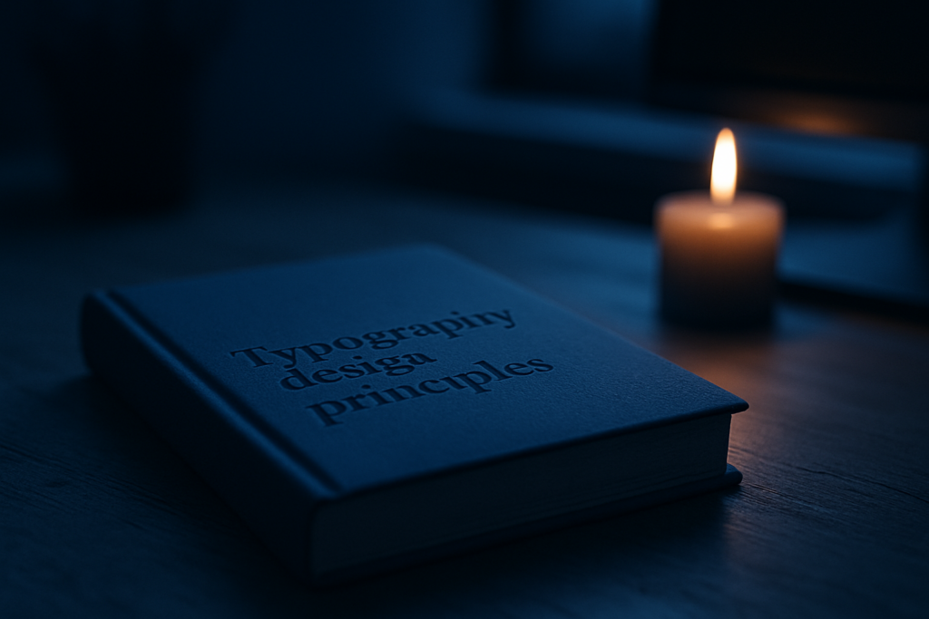
Know Your Foundation
Typography starts with getting your basics straight. First, typefaces and fonts aren’t the same. A typeface is the design think of it like a song. A font is the specific file or version used like an MP3 of that song in a certain key and tempo. For example, Helvetica is a typeface. Helvetica Bold 12pt is a font.
Next up: the serif vs. sans serif debate. Serifs have those little strokes at the end of each letter classic, formal, and often easier to read in print. Sans serifs drop the extra flourish. They’re modern, clean, and made for screens. Use serifs when you want tradition or elegance. Go sans serif for simplicity, speed, and digital first content.
Design harmony is where smart typography starts to show. Don’t just pick fonts you like match their style, weight, and size across your layout. A heavy bold header paired with a lightweight body font might clash if the spacing or shape feels off. Aim for a rhythm: fonts should support each other, not fight for attention.
And always always test how your typography holds up across screen sizes. What looks great on a desktop might shrink into a mess on mobile. Readability is non negotiable. If users are squinting, your design’s already failed.
Want to level up your foundation? Dive deeper into typography basics.
Align Font Choice With Purpose
Fonts aren’t just dressing they’re direction. Choosing the right typeface sets the tone before anyone reads a single word. A bold slab serif shouts confidence. A soft script whispers friendliness. The trick is to match the font with the message, not just the general mood. A startup pitch deck using Comic Sans won’t read as quirky it’ll read as careless.
Start by defining your tone. If you’re building something corporate or institutional, clean and modern sans serifs like Helvetica or Inter make sense. For something more expressive say a creative agency or design portfolio a hand drawn or geometric font might fit better. For playful? Round, bubbly fonts. For authority? Think strong weights and sharper edges.
It also matters how you use fonts. Display typefaces are meant to grab attention in headers, not carry the weight of long form reading. Pair one with a legible, neutral body font (like Georgia or Open Sans) to strike balance. Using a display font for paragraphs usually leads to eye strain and bounce rates.
Poor pairings happen when fonts fight each other. Don’t mix two fonts that are too similar or too different. A classic mistake: combining a condensed all caps headline with a narrow sans serif body copy. They blend, but not in a good way. Instead, focus on intentional contrast: serif paired with sans serif, bold with light, structured with fluid. Use a testing tool to preview how your choices work together.
Bottom line: fonts carry voice. Choose them like you mean it.
Build a Strong Typography Hierarchy

Good design doesn’t just look nice it communicates clearly. And that starts with a strong typographic hierarchy. Each piece of text should know its place. Headlines grab attention. Subheads guide. Body copy delivers.
The hierarchy lives in size, weight, and spacing. Bigger for titles, bold where needed, and just enough space to breathe. Don’t ask the reader to squint or guess what’s important show them. But here’s the catch: don’t rely solely on color to indicate importance. Colors vary across screens and don’t help every viewer equally, especially those with visual impairments.
Stick with two or three fonts at most. Over styling kills clarity. More fonts don’t mean better design they just clutter the message. Keep it tight, clean, and consistent. When structure works, the words lead the way without shouting.
Pair Fonts With Precision
Strong font pairings create clarity. Weak ones cause readers to bounce. The goal is contrast not chaos. A serif headline with a clean sans serif body text? Classic. But stacking two highly stylized fonts? That’s a traffic jam waiting to happen.
Some pairings work time and time again: Helvetica and Garamond. Futura and Georgia. Montserrat and Merriweather. These combinations balance personality with structure giving contrast without clashing. If you’re unsure, start simple: one expressive header, one clean and readable body font.
There are plenty of tools to take the guesswork out. Google Fonts Pairings, Fontjoy, and Adobe Fonts all let you test combos before committing. Try them, but trust your eye. Test on the actual layout, not just a blank page. Line height, spacing, and context change how fonts behave together.
Last point don’t chase trends. Fonts, like people, have personalities. Pick ones that match your brand’s tone, not the latest hype. A slick tech blog and a retro baking channel don’t speak the same type language. And that’s the point.
More pairing tips here: typography basics
Avoid Common Mistakes
Even the most visually stunning design can falter if core typography principles are overlooked. Here’s how to sidestep the most common pitfalls:
Over Styling and Under Testing
It’s tempting to add flourishes to make text stand out, but excessive styling often results in visual noise rather than clarity. Ensure every style choice serves a functional purpose not just a decorative one.
Avoid overuse of italics, all caps, or shadow effects
Test styles across different screen sizes and devices
Keep it clean: restraint communicates professionalism
Ignoring Spacing Fundamentals
Kerning, leading, and tracking are subtle adjustments that greatly impact legibility and aesthetics.
Kerning: Adjust space between individual letters for balance
Leading: Ensure sufficient line spacing, especially in long form content
Tracking: Manage overall letter spacing to improve readability
Neglecting these can make your text look cramped or disjointed even if the font is solid.
Misusing Decorative Fonts
Decorative or display fonts can be striking, but they aren’t meant for body text.
Use them sparingly for logos, headings, or limited callouts
Never use overly stylized fonts for paragraphs or lengthy content
Function should always take priority over flare when it comes to readability
Inconsistent Typography Across Platforms
A typographic system that looks sharp on desktop may fall apart on mobile or vice versa.
Test typography across different browsers and platforms
Use web safe fonts or host custom fonts properly
Maintain consistent font usage in brand materials, websites, and social posts
Typography consistency and thoughtful spacing choices deliver a cleaner, more professional experience no matter where your design is viewed.
Final Considerations
Good typography doesn’t just look clean it makes content usable. Start with accessibility. Fonts need to hold up under pressure: low vision, dyslexia, a bright screen in sunlight. Avoid overly stylized lettering for body text. Stick to minimum sizes at least 16px for most screen content and test your designs with real users when possible. Look into dyslexia friendly fonts like OpenDyslexic or Atkinson Hyperlegible when designing for inclusivity.
Next: licensing. Many designers trip up here. Just because a font is free to download doesn’t mean it’s free to use commercially. Read the license before using any typeface in client work or public projects. When in doubt, go with trustworthy sources like Google Fonts or Adobe Fonts, where licensing is transparent.
And yes, keep your font library fresh but don’t hoard. Update with intention. Ask yourself: does this new font add range or just noise? Trim the excess so you’re not drowning in choices during every project.
In the end, typography isn’t window dressing. It’s how your design speaks even before a single word is read. Get it wrong, and you lose clarity. Get it right, and your message carries further.